Conversion Rate Optimisation: Usability Tests
Two weeks ago we made a presentation for a project we had had with Jacob Jarnvall from Big Orange Button. The aim of the project work was to implement a number of guerilla usability tests.
But first: what is usability testing?
Usability testing is a way to evaluate a site by testing it on users. This means that a person performs a number of tasks on a web page. The tasks are selected based on something that a first-time visitor is likely to do on the website. The test manager and / or the test observer observe, listen and take notes on the person that performs the given tasks. By watching someone perform common tasks on a website is a good way to test if the website is usable. You get instant feedback on whether the test subjects can perform the tasks they were given. You also get to know about any problems that come up in the process.
The guerrilla usability testing is a quick and inexpensive variant of usability tests. Such tests are carried out in a public place, such as in a cafe or a train station. Test sessions tend to be short, but you get qualitative and detailed insights into your website. Disadvantages of guerilla usability tests is that they are not statistically robust and participants do not always match your target audience.
Project work
And now back to the project itself. First the class was split into groups. Each group should choose a web page and ask five strangers to perform a number of tasks on this website. Based on their feedback, the group would then offer suggestions on how the website can be improved.
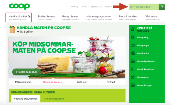
I did the project individually and for my analysis I chose the Coop website. One of the tasks I asked people to perform was to buy food: to search for a product (for example, a packet of milk), add it to the basket, and after that go to the checkout. In the end I got some interesting insight. A couple of people I interviewed would search for milk in the green box at the top right corner of the home page.
Source: Coop.se
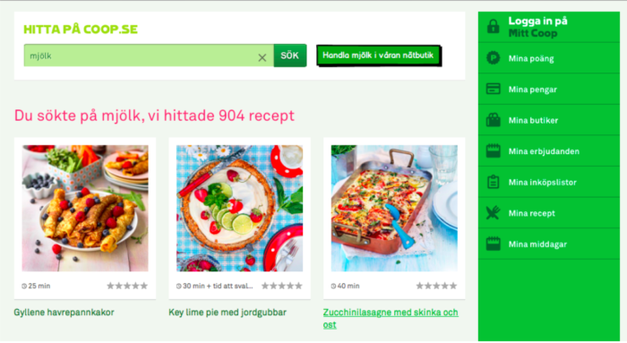
When you search with the help of this search box, search results do not include any products. The search results only contain recipes and articles with milk. Based on that my suggestion was to add a button that takes the visitor to the Coop’s online store so he or she can order this product:
Source: Coop.se
The mockup drawing was built with the help of Balsamiq mockups software.
Which usability tests have you implemented?

