Web analytics tools
In my previous post I wrote about how you can track content engagement with Google Analytics. There exist many other content analytics and web analytics tools to measure visitor engagement and optimize your business. In the first part of this post you will get a brief overview of the tools that can give you new perspectives on how visitors act on your site. In part two I will show how some of these tools can be used with the help of statistics from my blog.
Web analytics tools
- Moz Analytics is simply one of the largest SEO companies.
- Clicky Web Analytics is an advanced analytics tool that generates traffic statistics in real time. By using Clicky you can follow every visitor to your website and learn how different types of visitors behave.
- Optimizely is a tool to measure and improve your site through A / B testing. Furthermore, you can create experiments with the tool’s visual interface that is very easy to use.
- KISSmetrics is a web analytics tool that provides you with information on user engagement and habits before and after they made a purchase on your website. Based on that information you can build on customer acquisition and customer loyalty.
- Screaming Frog SEO Spider is a web crawler tool that crawls through links, images and other elements on your webpage to analyze them from the SEO perspective.
Heatmaps and more:
- Crazy Egg offers a number of visual ways to see how people navigate your site, including heat maps and scroll maps.
- Hotjar is best known as a tool for heat maps, conversion funnels and form analysis.
Data visualisation:
Web analytics is not only about collecting the data and analysing it. It is also important to visualize the results of the analysis when they are presented to other interested parties. The following are some of the tools that can be used for data visualization:
Content Tracking: Analysis and Reporting
I have tested some of these tools on my blog to get an understanding of what content my readers are most interested in.
Hotjar
I used Hotjar to understand how visitors have moved around my website using heat maps and recordings feature.
Which of Hotjar features I have used for my blog?
Heatmaps: heatmaps allow you to get a visual picture of the visitor’s interaction with specific pages. The tool will also help you see the components that are critical to your workflow. In the basic version you can use up to 3 heat maps simultaneously. You can choose among Click, Move or Scroll heatmaps as well as see the data for different device types.
- A Scroll heatmap shows the percentage of visitors who actually have seen different parts of the page. It also identifies a fold position. The content that is above the fold can give you insights on for example a high bounce rate or exit rate.
- Click-maps: many web analytics tools track elements that are clickable. Click heatmaps also show interaction with the elements that are not clickable.
- Hover maps: Move heatmap tracks the movement of the mouse pointer giving an indication where the visitor has focus. This can be useful when the page contains many elements the visitor fails to act on at all.
Survey: I use this function to get inspiration for future blog posts. The survey runs on both the Swedish and English versions of the blog in the respective language.
You can easily install Hotjar on your website with the help of for example Google Tag Manager.
Klipfolio
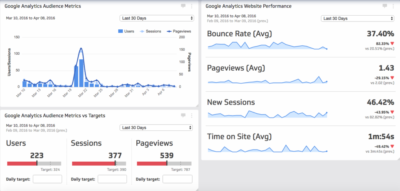
I have also started a trial account at Klipfolio and tested different features. It is easy to connect your Klipfolio account to Google Analytics or other analytics tools. To begin to visualize your data you can use any of the template klips available in klip gallery or build your own dashboard:
You can also import your data from an external source. I have chosen to both connect my Google Analytics account and import statistics on how many visitors are reading my posts from an Excel file. Then I used the data to build the following graphs in a dashboard:
And you do not prepare your data before you import it into Klipfolio. Using different functions you can manipulate the data within Klipfolio’s interface to produce just the numbers you need for a dashboard.


 Previous Post
 Next Post


Hi, There’s no doubt that your site could possibly be having internet browser compatibility issues. Whenever I look at your site in Safari, it looks fine but when opening in Internet Explorer, it has some overlapping issues. I just wanted to provide you with a quick heads up! Apart from that, great blog!